Fuzzy Bars 2.0
Redesigning our predictive model to better communicate uncertainty and timing
My Role
- Position: Staff Software Engineer
- Responsibilities: Ideation, UX/UI Design, Cross-Team Facilitation
- Collaborators: Journalists, Designers, Engineers, Leadership
Summary
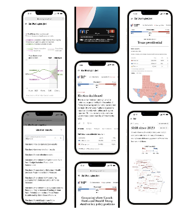
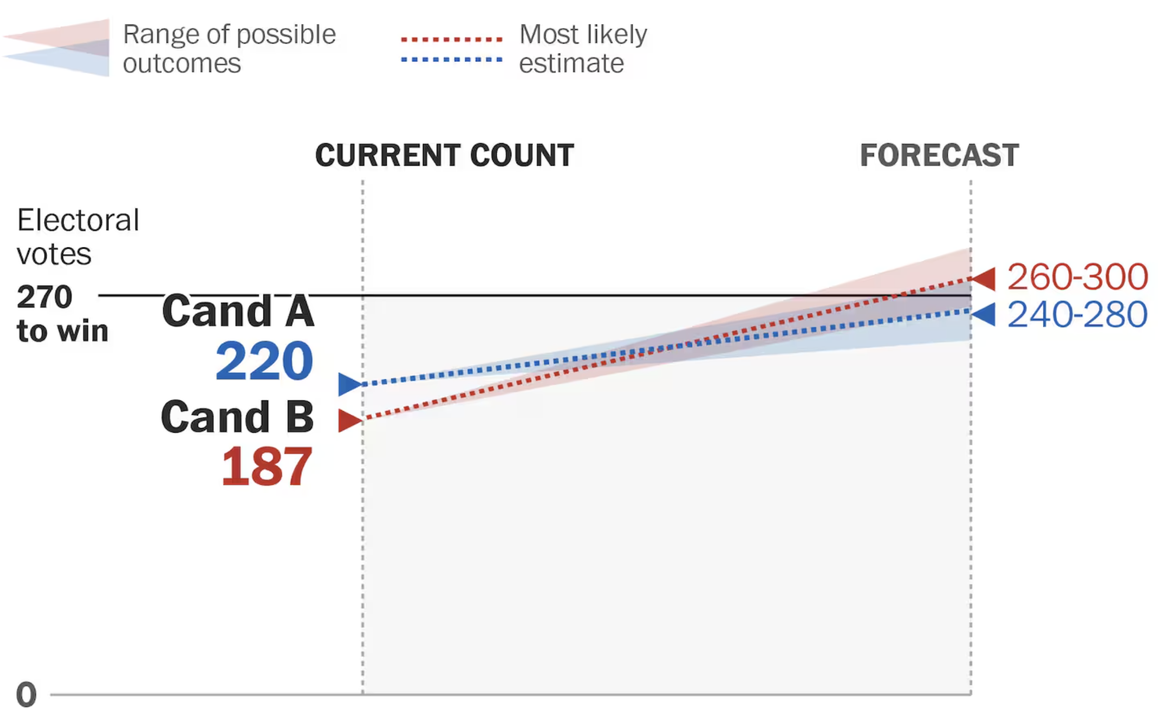
Fuzzy Bars 2.0 was a complete rethinking of our predictive election model visualization. After receiving feedback that the original version was confusing, we launched an internal design hackathon to ideate more effective ways to communicate what the model was, and what it wasn’t. The new design emphasized the temporal nature of the prediction: a snapshot in time that would be compared later to live results.
Problem
Readers often misunderstood our predictive model as current vote results, leading to confusion about how to interpret it. We needed to make the uncertainty, timing, and evolving nature of the prediction more visually and conceptually clear.

Goals
- Clarify the difference between predictions and vote counts
- Highlight the moment-in-time nature of the model
- Enable comparison between prediction and real-time results
- Ensure the visual remained elegant and scannable
Process
Following our internal hackathon, a compelling new direction emerged that made the time dimension explicit. I took that idea and expanded it, sketching dozens of variations in Figma that ranged from subtle tweaks to structural redesigns. I presented options to stakeholders across design, editorial, and leadership. After collaborative feedback and refinement, we aligned on a direction and I supported a more junior engineer in leading implementation.
Design Decisions
- Emphasized the temporal dimension with time indicators
- Distinguished predictions from results using layout and color
- Iterated on iconography and motion to communicate uncertainty
- Prioritized accessibility and editorial clarity throughout

Challenges
The core challenge was finding a design that felt intuitive but didn't oversimplify. Balancing nuance and clarity required thoughtful iteration, careful alignment with editorial standards, and buy-in from a wide range of internal stakeholders.
Impact
- Generated dozens of Figma prototypes to drive ideation
- Facilitated alignment across editorial, design, and engineering
- Mentored a junior engineer through implementation of a high-visibility feature
- Positioned the predictive model for clearer public understanding in future elections
Reflection
This project was about more than just a redesign. It was about transforming feedback into clarity and creating space for others to lead. I’m proud of how collaborative and creative the process was, and excited to see how readers engage with the new version moving forward.
Project information
- Category UX/UI Redesign, Data Visualization
- Client The Washington Post
- Tools Figma, React, TypeScript, D3
- Project date May–June, 2023