Bubble Map for Election Results
Improving geographic clarity with a vote margin map alternative
My Role
- Position: Staff Software Engineer
- Responsibilities: Product Ownership, Front-End Development, Data Visualization
- Collaborators: Elections Team, Editors, Graphics Department
Summary
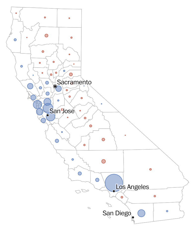
In the week leading up to the 2022 midterm elections, I developed a bubble map to replace or supplement our standard choropleth maps. The goal was to more clearly convey vote margins in each county, avoiding misleading impressions that come from coloring large but sparsely populated areas.
Problem
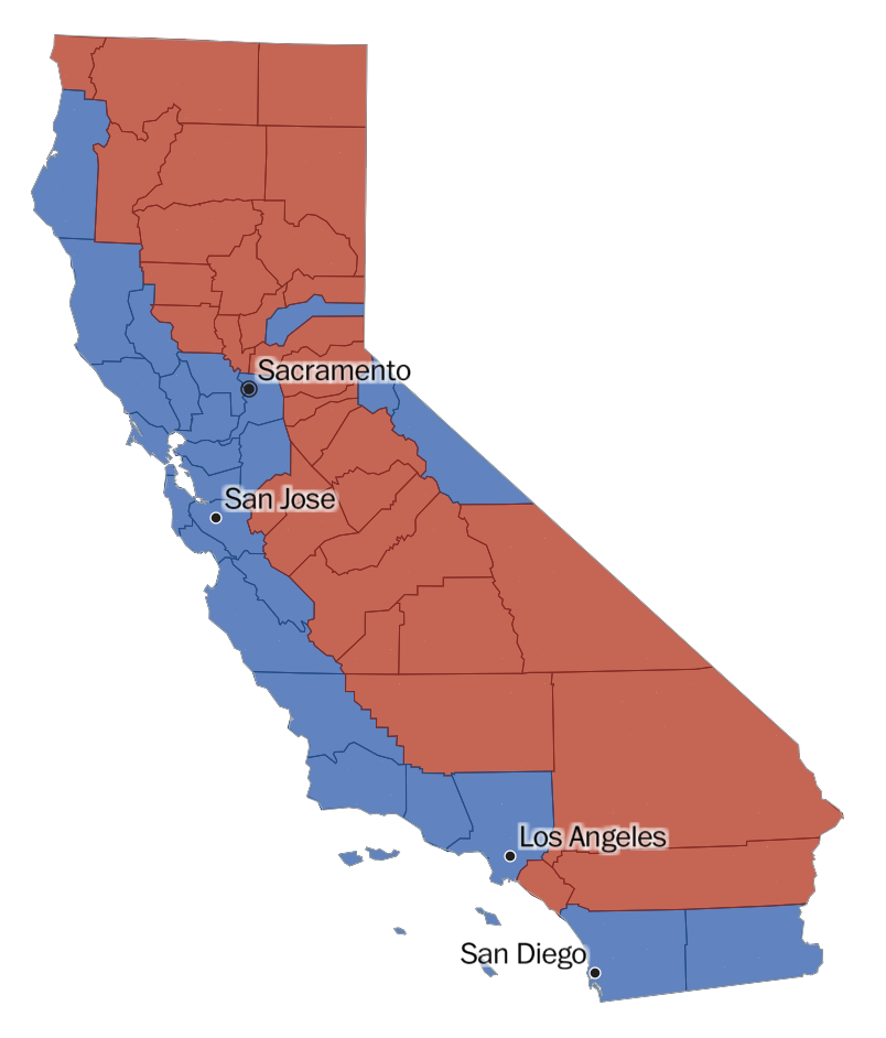
Our traditional choropleth map shaded geographic areas based on vote leaders, but this approach often misrepresents reality, as land area can visually overpower vote count. For example, large rural counties with few voters appeared dominant simply due to their size. We needed a better way to represent margins of victory without distorting perception. You can view an example of the old map here.
Goals
- Provide a more accurate visual representation of vote margins
- Reduce reader confusion caused by misleading geographic scale
- Ship a complete, well-tested feature in time for election night
- Lay groundwork for more interpretable geographic visualizations
Process
Journalism moves fast. My team and I were very used to quickly shipping products under tight deadlines. This feature was not prioritized on our roadmap, but my team and I felt very strongly that it provided necessary context to readers.
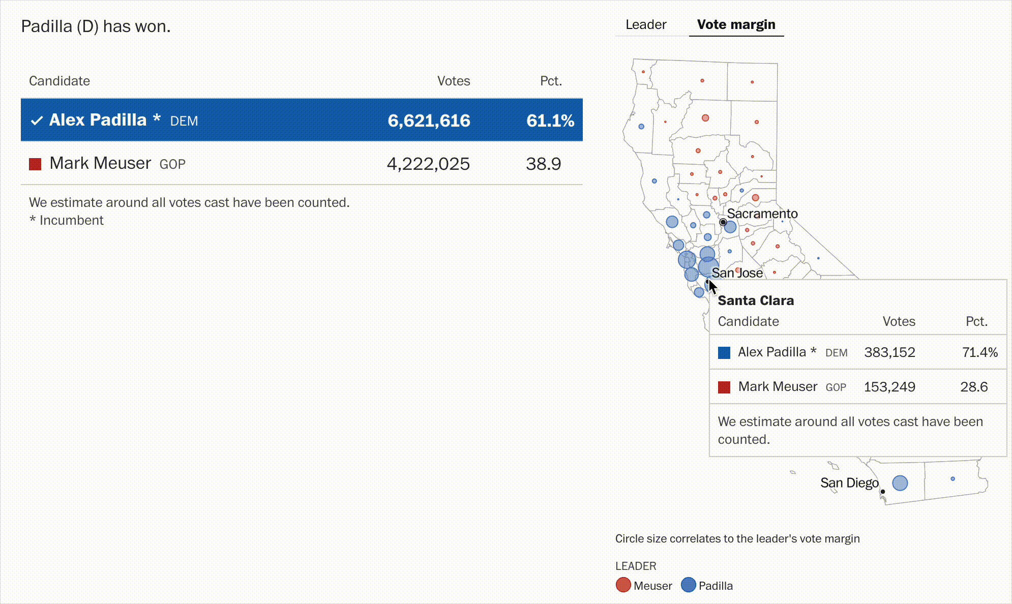
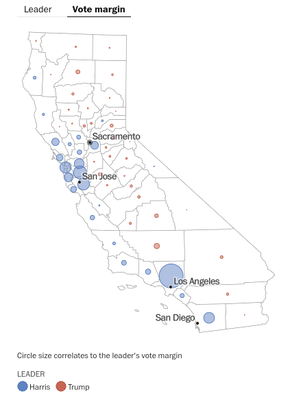
Therefore, though the midterm elections were upcoming, I consulted with my manager, and decided to take full ownership of building the new bubble map. I designed it to size each bubble based on vote margin rather than geography, creating a much clearer sense of the race. I built the feature using D3 and React, and worked closely with our data pipeline to ensure smooth integration. I thoroughly tested it across different states and edge cases, and we launched it successfully for the 2022 midterms.
Design Decisions
- Used bubble size to represent vote margin rather than land area
- Color-coded bubbles by leading candidate to maintain consistency
- Positioned bubbles relative to county centers for geographic context
- Ensured performance and responsiveness at scale
Challenges
Shipping a new election visualization on a tight deadline was ambitious. I had to move quickly while ensuring accuracy and resilience. One key takeaway was that while the bubble map solved several problems, it also introduced new interpretability challenges. Some readers found it difficult to understand. We, therefore, created a an explanation under the visualization and also kept the choropleth map as an option that you could tab to.
Impact
- Successfully launched in time for the 2022 midterms
- Praised by leadership and well-received by readers
- Set a new standard for geographic election visualizations at The Post
Reflection
This project was a personal initiative that turned into a newsroom-wide win. I’m proud to have shipped something I believed in, and I learned a lot about how to balance clarity, accuracy, and reader comprehension in geographic visualizations.
Project information
- Category Data Visualization
- Client The Washington Post
- Tools D3, React, TypeScript, Mapbox
- Project date November, 2022
- Project URL https://www.washingtonpost.com/election-results/2022/california/
- Visit Website